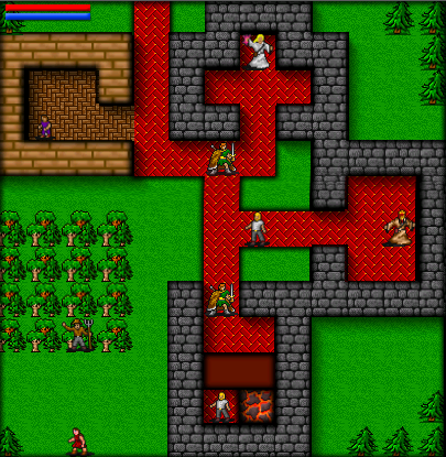
Okay. I’m thinking about making some graphical improvements to Inaria. You might remember from when I was doing the iPhone version that it looked a bit…well, better.

Those improvements, which make the levels pop up and down, were written by my good, dear friend Ryan Clark.
So why didn’t I use them for the current version of Inaria? Well…because I thought they might clash with the retro mystique I was going for. It might also clash with the “black squares” result of the visibility algorithm.
But now I’m thinking seriously about putting them back in.
Thoughts? Yay, nay?

Yay. I don’t think they clash.
The moment the screenshot loaded, I was like, “ooh, that’s nice!”. Yes, I think they’re fine and don’t clash at all. In fact, they give it quite a unique style. IMVHO. 🙂
I like it. Do the same thing to the trees.
Do eet!
Wow, that does look quite nice. It’s like… retro, with a bit of depth and shading. I don’t think it would take away from the retro feel of the game at all.
Of course, the answer is simple. Do both. Have an option that allows the player to select whether they prefer ‘Modern’ or ‘Classic/Retro’ graphics, similar to how they’ve done with some iPhone remakes of classic games. Unless that would add too much work to be worthwhile.
I say definitely YAY! Looks better that way, it gives the game a unique look also, I agree with Sol_HSA in that, go for it! Cheers!
Go for it! If possible make it user configurable so retro purists can do it the old way 😀
Wow. completely positive feedback! I think that’s a first.
Oops! Can’t have that!
You are taking to long to post anything! Hurry Up!