I am on a roll today.

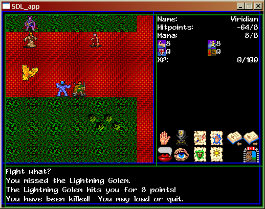
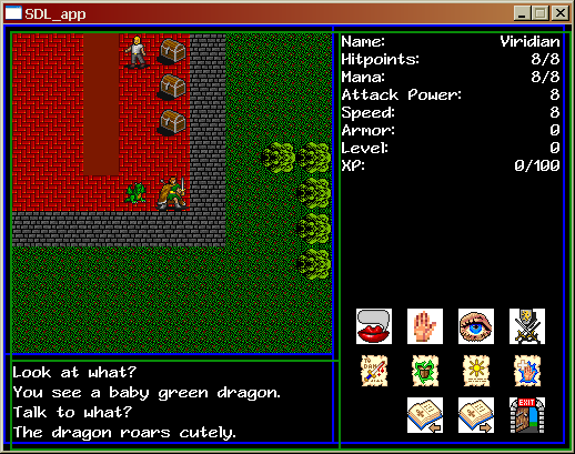
Again, much done in a short time. You’ll notice I changed the layout of the screen. The text area was just too small; all of this game’s personality is going to come through the text, so I need to be able to get as much of it on the screen as possible. I got unstupid about my button arrangement – I don’t know why I thought I needed three lines for that; two not only gives me more space but I think the buttons look much better in their logical groups. I also finally took the white flash off the rest of the icons, also making them look better.
But then I had a problem – I need enough space for my inventory. I need a 128×128 block to represent the sixteen items the player can have in his backpack. (Yeah, it’s like World of Warcraft…it’s also like Ultima VI!) Moving the GUI buttons up infringed on that space, so I found a way to compress the character data at the top of the screen using icons I found on the web. One side effect of this is that my tile sheet is now bigger than 256×256. I’m willing to give up that limitation; I need those icons, and I’m going to need more icons in the future.
What else? Oh, yeah, combat! You can now take swipes at NPCs, and NPCs can take swipes at you (if they are hostile to you). An NPC’s attitude toward you is separate from their movement AI, so I can have NPCs that just wander around, hitting you if they happen to get near you, or NPCs that seek you out to put the beat down on you. I can even have NPCs that just stand there and can only hit you if you come into range (the Carnivorous Mushroom is one of these).
Next I need inventory, picking up items, buying and selling. Which means I need to figure out exactly what the merchants in town are going to sell.

