Day: April 18, 2006

Star Revolution Update 3

I am Star Revolution! Check me out! No, seriously, check me out!
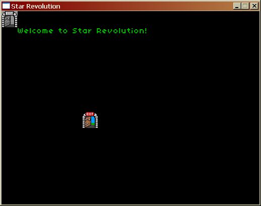
Spiffing!

I know, I know, it doesn’t look like much…but these are all black triangles that prove that my new state system, gui system and font system all work.

I really like the font…I found it here (by Googling “bitmap font” and clicking on the very first link). It’s evocative of Starflight without being quite as limited as that font – it has true lowercase and descenders, for instance. This is going to be the official Star Revolution font unless everybody stands up and says they hate it for some reason.

I have also surreptitiously begun work on a tool to create individual planets. It needs some work (for one thing, I need a better understanding of Perlin Noise) but it’s coming along and I expect to have something much more impressive to show you soon.

Also note that I’m not numbering my hours. I have abandoned the idea of writing SR in 40 hours; it’s simply too big. I’m sure I could write a version of SR in 40 hours, but I want this game to be worth playing, unlike Inaria. So I am switching tactics. Instead of a fixed amount of time, I am simply saying that the game must be completed and published by July 31, which gives me three and a half months.


Starflight Stuff

Starflight has long been one of my favorite games, although its interface is very annoying…sometimes I wonder how I put up with stuff like that when I was younger (answer: I didn’t have another space opera RPG to compare it to, of course).

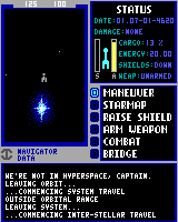
I’ve been playing Starflight 1 and 2 again as reference for Star Revolution. I was playing Starflight 2 when I noticed something odd…look at this screenshot. Doesn’t it look weird in some way?

Hmmm...

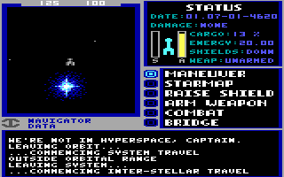
And doesn’t this screenshot of Starflight 1 look kind of…chunky? Even for a 320×200 game?

Boldly go.

In fact…

Bll o.

This is a screenshot for the original Starflight reduced to 160×200. Notice that all of the text is still readable and all the graphics look the same, just narrower. It’s almost as if the game were written to run in 160×200…which is exactly what it was. Starflight was written to run in a 160x200x16 color mode available on some CGA/composite monitor combinations (most notably Tandy and Compaq computers). When the EGA and VGA versions were created, the image was simply doubled horizontally.

Which brings us back to the Starflight 2 screenshot.

Hmmm...

Notice how much more detailed the picture of the Tandelou Eshvey looks than the rest of the interface! The developers of Starflight 2 did not bother to try to make the interface look any better, even though Starflight 2 was written specifically for VGA! The only thing they did was use the additional horizontal resolution to make the font a bit clearer. How disappointing!